Redesigning Campus Menu Navigation
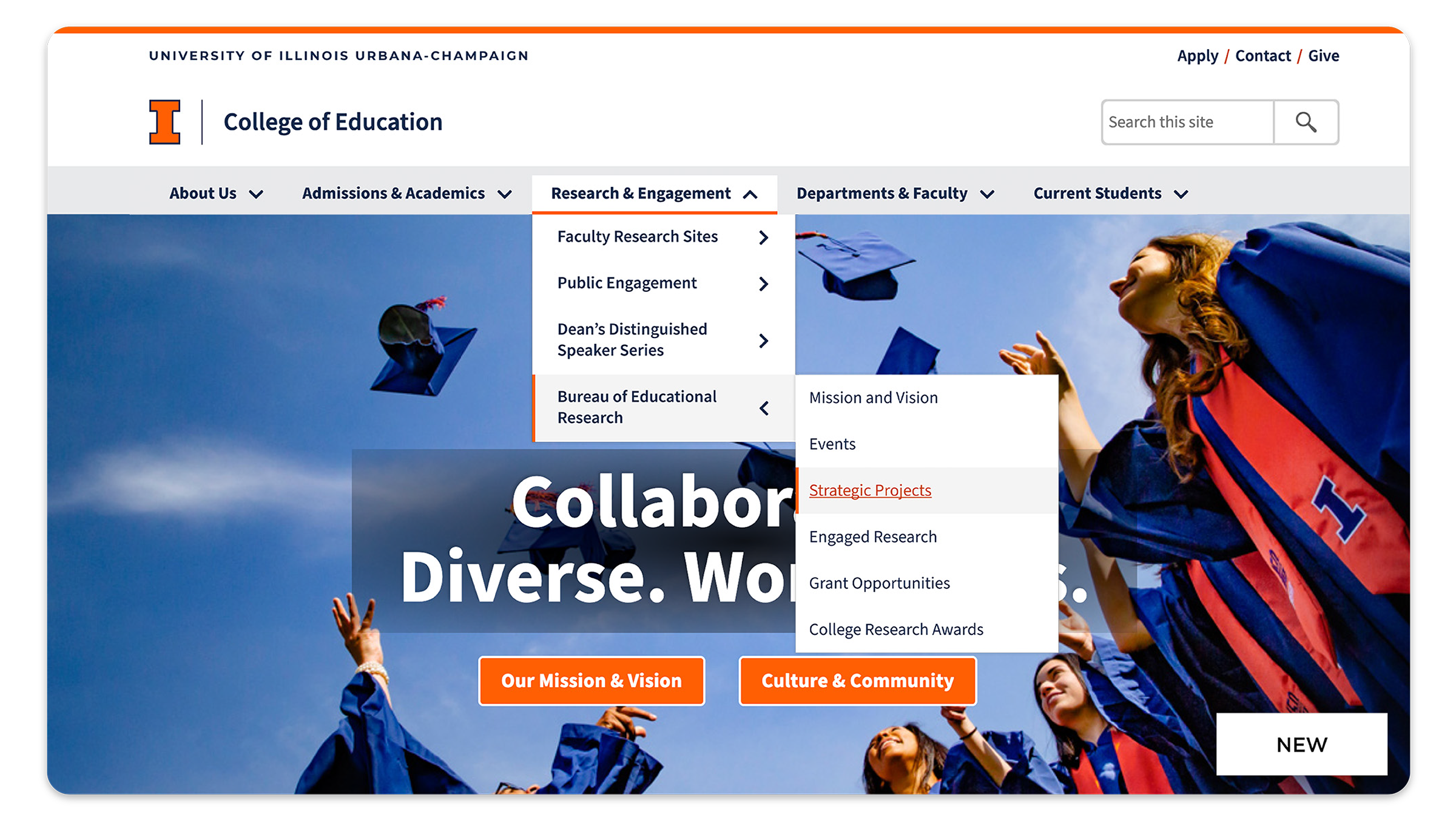
Explore the redesign of the University of Illinois menu navigation; focusing on enhancing user experience, improving accessibility, and streamlining site navigation to better serve our students, staff, faculty, and community.

My Roles
- Project lead
- User research
- UI design
- Prototyping
- Developer handoff
Tools
- Figma
- HTML/CSS
- Microsoft Teams
- Github
- Asana
Results
- Decreased design to dev handoff time.
- Offered CMS users a flexible solution for their information architecture needs.
- Implemented on all illinois.edu sites.
The Challenge
- Complex Navigation Structure: The existing menu had a complicated and unintuitive layout, making it difficult for users to find important information quickly.
- Diverse User Needs: Balancing the needs of a wide variety of users, including prospective students, current students, faculty, staff, and peer institutions, all of whom have different priorities when navigating the website.
- Mobile Optimization: Ensuring that the new navigation system was optimized for mobile user, where space is limited, and maintaining ease of access across different devices.
- Legacy Design Constraints: Working within the constraints of the existing university branding and design guidelines while still making significant changes to improve the navigation experience.
- Team Alignment: Aligning various teams (IT, marketing, admissions, etc.) to ensure the new navigation met both functional and aesthetic expectations across colleges and units.
- User Testing and Feedback: Collecting and incorporating meaningful user feedback in a large, diverse academic community to ensure the design truly improved usability.
Strategy
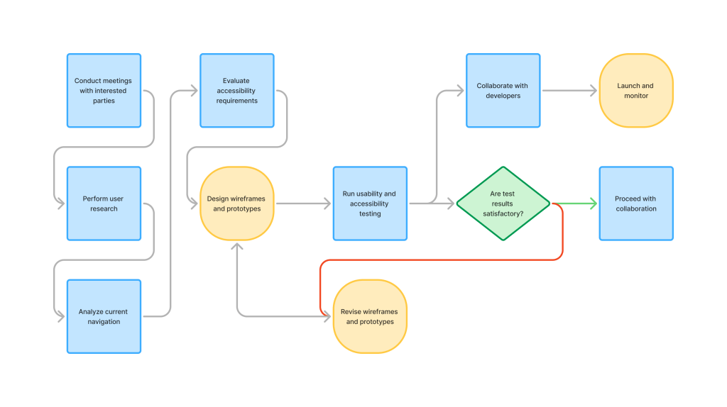
- Conduct meetings with interested parties
- Perform user research
- Analyze current navigation
- Evaluate accessibility requirements
- Design wireframes and prototypes
- Run usability and accessibility testing
- Collaborate with developers
- Launch and monitor
Insights
Navigation Confusion
Users expressed difficulty in finding specific information due to the lack of access to multiple levels of links.
Mobile Usability Issues
Mobile users indicated it was challenging to navigate the site on smaller screens.
Accessibility Gaps
Users identified issues with the menu system’s accessibility, primarily around navigating the menu.
Impact
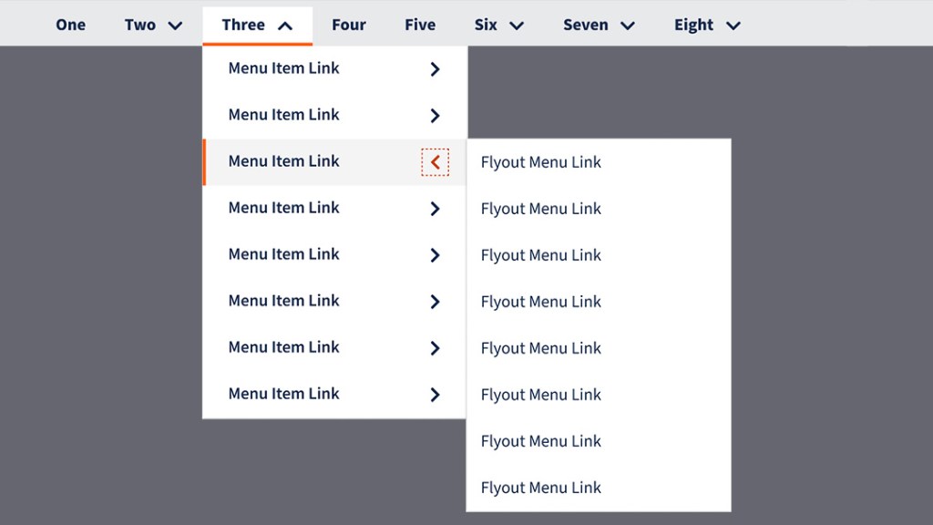
Flyout Menu
An optional third tier of menu links for organizing large amounts of content and additional information access.

Active Page Indicators
Bar shape indicating active focus states for locating the user’s current place in the menu.
Keyboard Accessibility
Ability to navigate through the menu with arrow keys for better keyboard navigation.
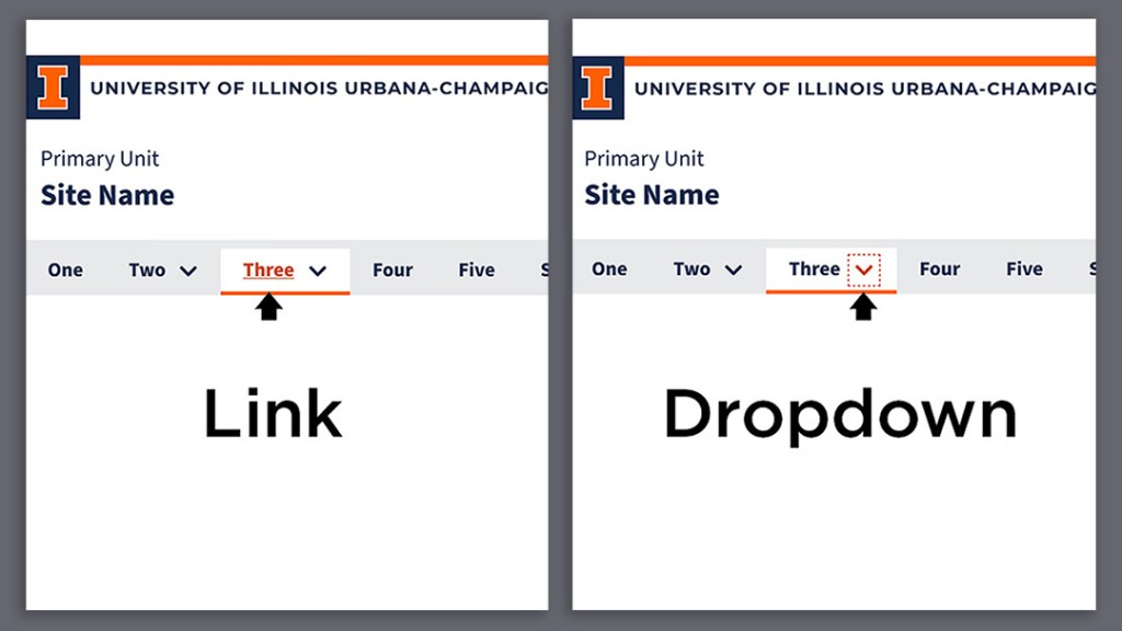
Separate Actions
Separate actions between the link and the chevron to dropdown/flyout the menu(s), building user confidence.