Transforming a Print Report into an Inclusive Web Experience
Examine the translation of an annual print brochure into a dynamic and accessible web experience, showcasing the College of Education’s achievements to peer institutions, major donors, and the general public, leveraging cutting-edge tools and design for optimal performance and accessibility.
My Roles
- Requirements gathering
- UI design
- Prototyping
- Developer handoff
- Accessibility testing
Tools
- Figma
- HTML/CSS
- 11ty
- SkipTo
- Illinois Toolkit 3.0
- Github
- Microsoft Teams
- Asana
Results
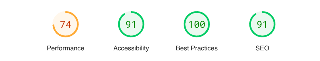
- Significant improvements in performance and accessibility.
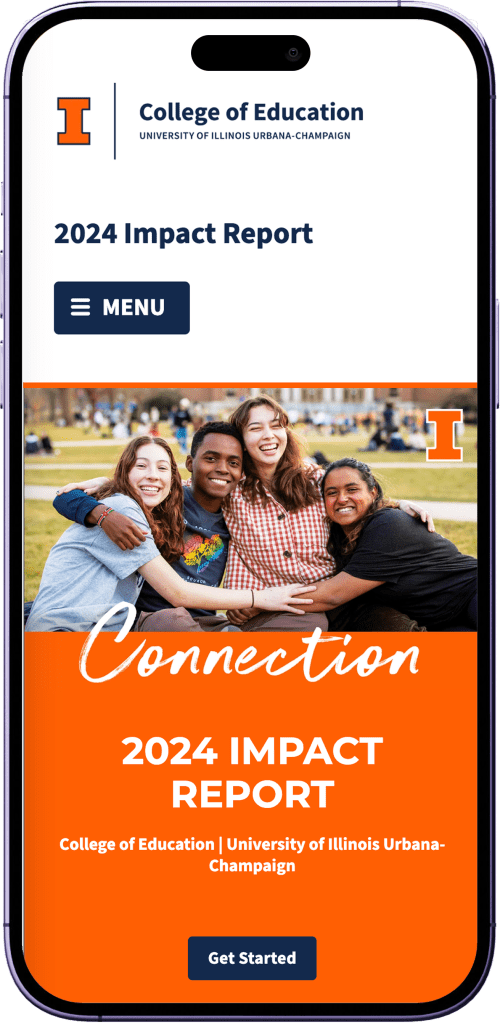
- Improved mobile device experience.
- Created a standard and has been extensible for other projects.
The Challenge
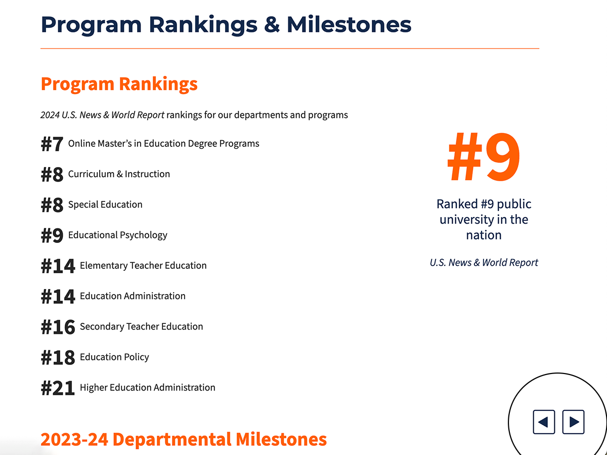
- High-profile nature: The project is driven by the latest release of the US News & World rankings, making it last-minute and high-stakes.
- Tight timeline: The project had a very tight timeline from receiving the PDF to finalizing the website, with multiple stages of design, review, and implementation compressed into a few weeks.
- Coordination and communication: Ensuring smooth communication and coordination among team members (designers, developers, communication team) throughout the project.
- Initial website translation limitations: Previous translation of the PDF to a stand-alone website was accessible and mobile-friendly but lacked a full browsing experience.
- PDF to web conversion issues: Difficulty in finding an optimal way to present the PDF online, with previous attempts (Issuu, direct PDF upload, splitting into single pages, IFraming) resulting in poor user experience on smaller screens and accessibility problems.
- Integration of new tools and technologies: This year involved integrating Toolkit 3.0, redesigning with Figma, and rewriting the 11ty backend, which required significant effort and coordination.
Strategy
1
Gathered timeline and design requirements to weigh technology options and solutions.
2
Designed Figma screens and prototypes with a custom side navigation.
3
Incorporated a review stage by the Communication team, ensuring that feedback was integrated early in the process.
4
Translated the Figma designs into the website, ensuring that the core elements were in place with an 11ty upgrade.
5
Conducted an internal review of the generated website, followed by a period of intense fixes and adjustments to address any issues.
6
Implemented the final notes from the Communications team and officially launched the site, ensuring it met all requirements and standards.
Design Considerations
Incorporating Illinois Branding
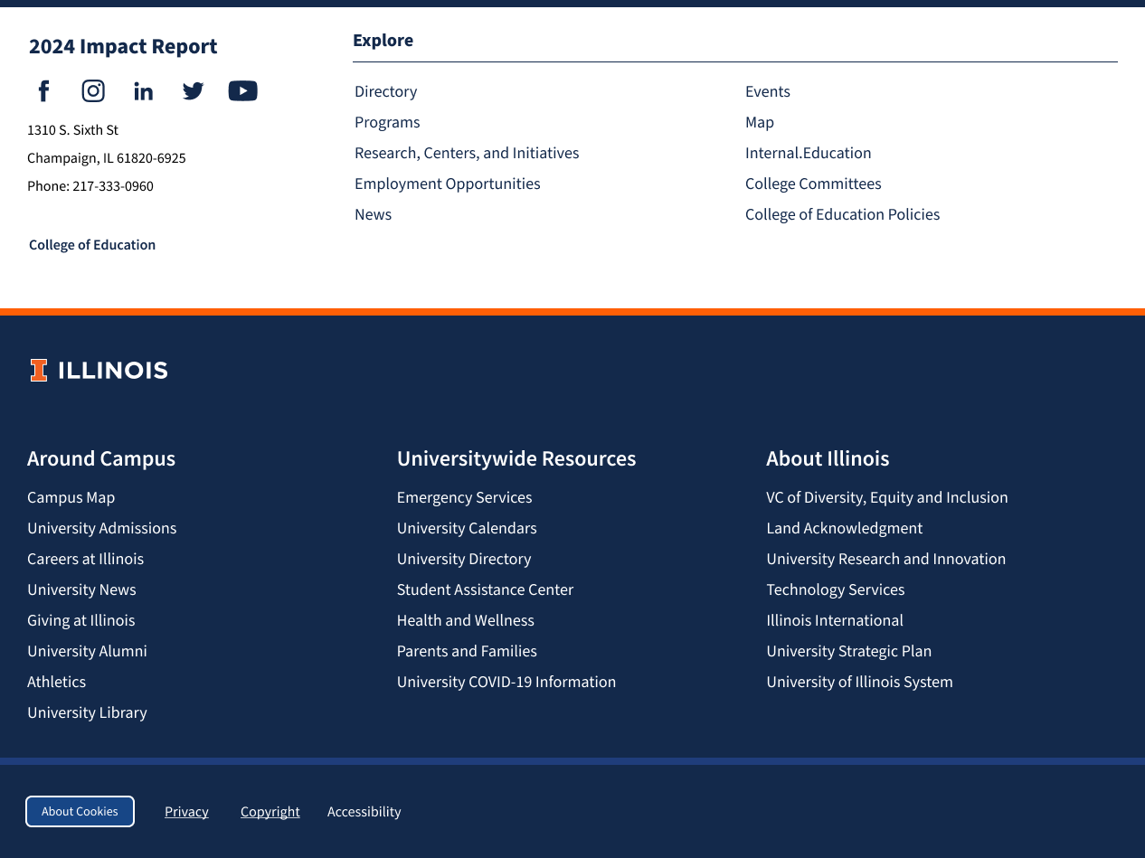
Keeping with Illinois brand standards, we found a way to incorporate the Illinois footer while maintaining our “flip-book” interface by inserting it within the right-hand section below each article, rather than mixing it with the side navigation menu.
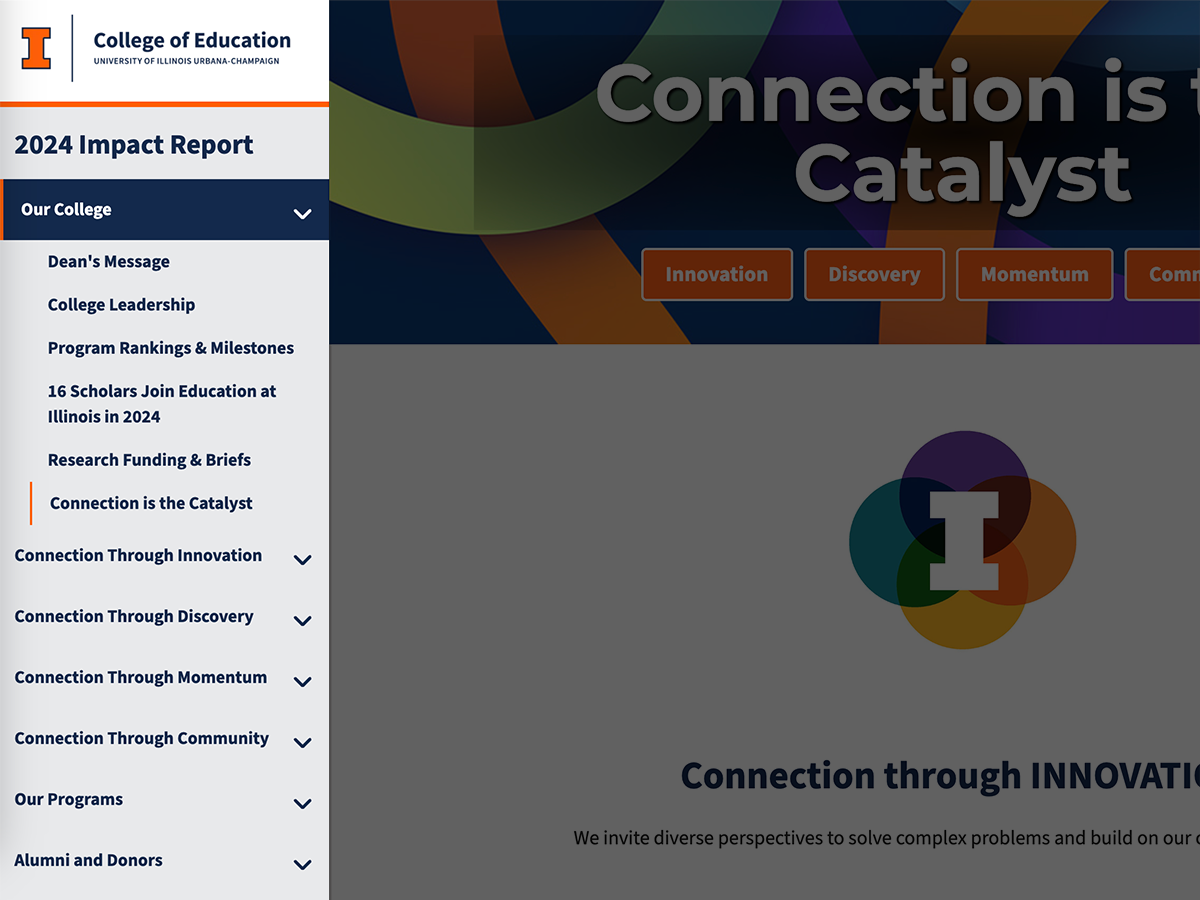
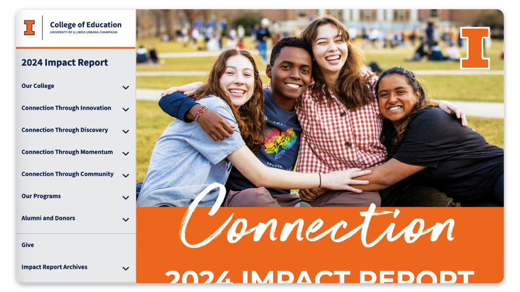
Fixed Side Navigation Menu
The side navigation is fixed on the left-hand side for desktop users and is collapsed for mobile users. When scrolling through articles, it remains fixed. It also indicates which article you are presently on and is keyboard navigable via tab and arrow keys.
Previous/Next Buttons
To maintain the “flip-book” experience, we incorporated previous and next buttons that are fixed to the bottom right corner of your page. No matter how far you scroll on the page, those previous and next buttons are accessible and located in a consistent place on the page, no matter the page.
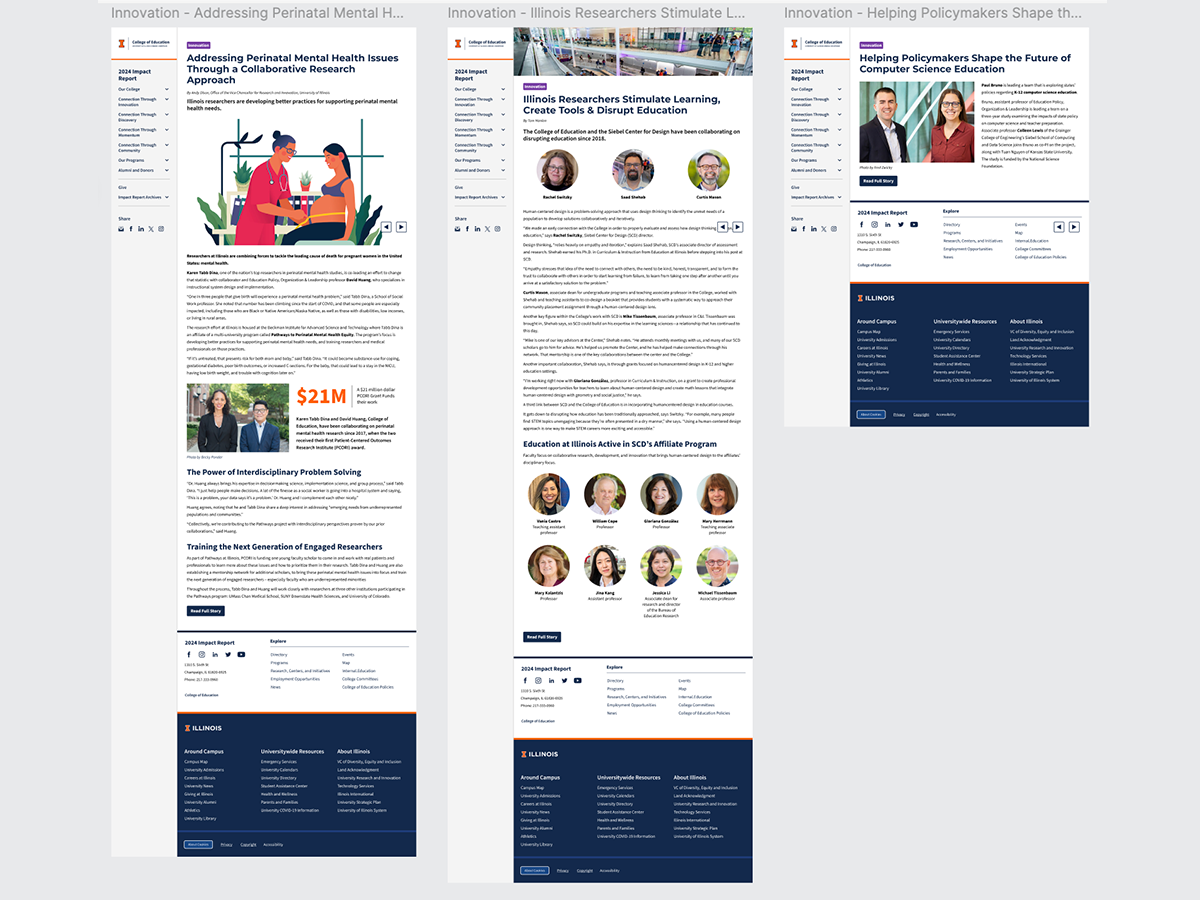
Templated Layouts
While the original print version does not have many consistent templated layouts, we decided to implement them for a dynamic and usable web interface. From page to page, the user generally knows what to expect in terms of white space, button placement, category tags, and image alignment.
Lighthouse Reports
Mobile
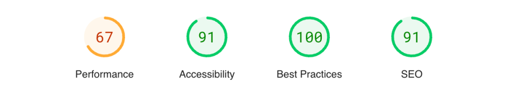
Desktop